
Portfolio
This page consists of all the projects I've done for school and in my free time. I've done projects such as mock-ups, typographic studies, illustrations, color studies, still-life drawings, video editing, motion graphics, and infographics.
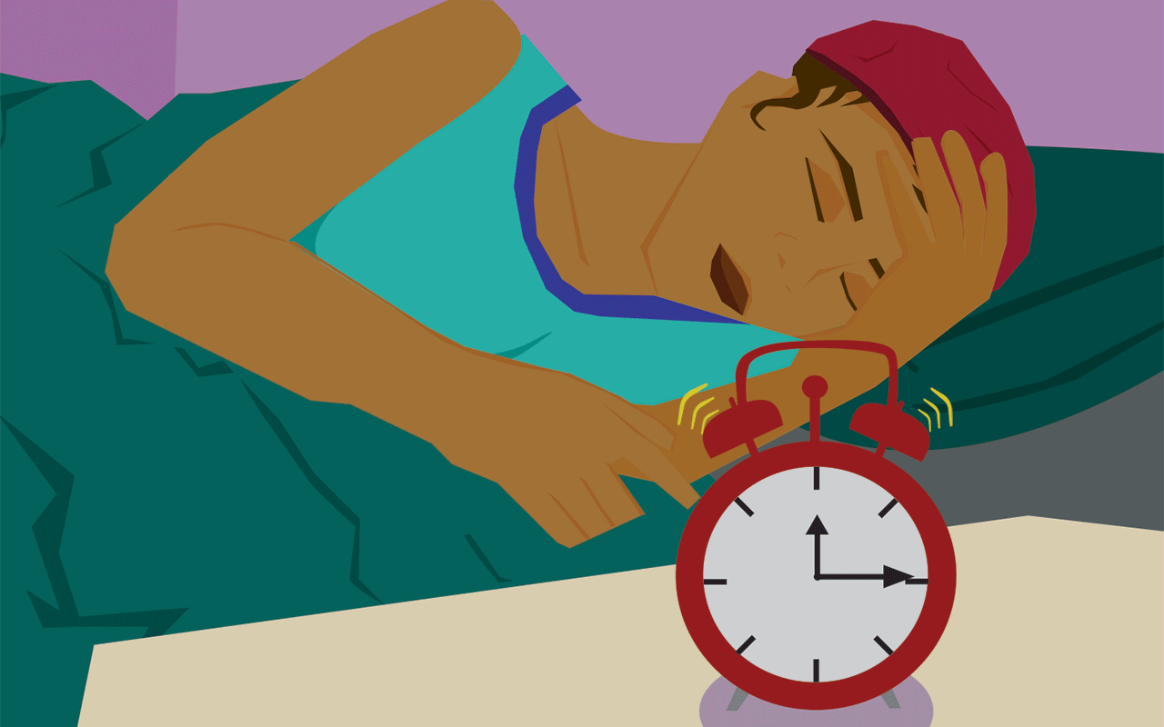
Snooze
“Snooze” is an animated cinemagraph meant to illustrate the all too relatable experience of being woken up by an alarm just to set it to “snooze” to sleep if only just a little longer.
A feature of this cinemagraph that enriches the meaning of this art piece is that it continuously loops. This reflects the continual habit of constantly waking up from the alarm, setting it to snooze to nap just a little longer, and then being woken up by it again and recreating the cycle.
This work was built in Adobe Illustrator with the pen tool. I created the style of art based on what I would and wouldn ‘t set to move. In this animation, only the alarm, eyes, and arms move. For the color palette, I chose warm colors that were split complementary so that it was visually soothing while also rich in contrastive color.

Map of Headland
This composition is a playful representation of the small town of Headland, Alabama. As it is my childhood hometown, I wanted to represent some of the locations in town that I loved to see as a kid. I created this art in Adobe Illustrator in a bright and colorful color palette.
This map features five locations:
1) The Airport which was always special to me as we would get to have occasional sightings of low flying planes;
2)The Town Square where the town is the most active bustling with shops all around a gorgeous park with a historic statue;
3) CornDodgers Farm which was a fall-time classic location where you’d explore the maze, sit in beds of corn, and enjoy the playground with other kids;
4) Skeet and Gun Club which wasn’t a place I frequented as a kid, but was an emblematic place of the surrounding culture; and
5)The Todd Farms which basically greeted you into the town with its large and red barn style building where you can help yourself to all kinds of southern delicacies.
This illustrative map would be a great illustration in welcoming new people into the small town and its culture.

Stare Deep
“Stare Deep” was an independent project of mine where I really wanted to illustrate the dreamy, yet gloomy nighttime sky. I could see this work act as a background for another illustration or as its own poster.
I created this artwork in Adobe Illustrator where I focused on creating bold colors in varying values in a flat, stylized style. I chose an analogous color palette of blue, indigo, purple, and lavender contrasted with pale yellows.
The message I intended to convey with this illustration was one that could draw out deep feelings for the viewer. The night sky is sentimental and personal for almost everyone for how vast and beautiful it is and how so many prominent memories were created under them. For some people, the night sky shines a positive light and brings out deep feelings like hopefulness and nostalgia and opens up opportunities to deeply bond with other people. On the contrary, the night sky can make others feel rather despondent and wistful for the past memories the sky reminds them of or for how the sky leads them to think. One thing for certain, the moon and stars in the sky causes for all of us to get lost in deep thought.

Swoon to Death
“Swoon to Death” is an illustrative typography artwork featuring a line from the poem “Bright Star” by John Keats. The phrase comes from the final line of the poem, “And so live ever—or else swoon to death.” I’ve always loved the phrase so I knew that I wanted to dedicate an artwork to it.
It was my goal for this composition that I reflect the idea and aesthetic of the line. I find the intertwining of love and death as concepts very beautiful and intriguing, so to essentially say that you will love someone so passionately to your own death is just so fascinating to me. It did not take me long when thinking of a message to illustrate through an Illustrated Typography that I wanted to use the phrase “swoon to death” from the poem as I felt these words alone carried the strong feelings of the poem.
I find the intertwining of love and death as concepts very beautiful and intriguing, so to essentially say that you will love someone so passionately to your own death is just so fascinating to me. It did not take me long when thinking of a message to illustrate through an Illustrated Typography that I wanted to use the phrase “swoon to death” from the poem as I felt these words alone carried the strong feelings of the poem.

Hung Up & Left Out to Dry
My artwork “Hung Up & Left Out To Dry” depicts a nostalgic, hazy view of an apple, a pair of shoes, and shirt outside. I wanted for my viewers to get a familiar and cozy feeling when viewing this art piece so I created it with chalk pastels. Chalk pastels are great for smearing, blending, and leaving a soft touch to an art piece. I feel that this artwork would be good framed as a regular artpiece.
The items in this composition were chosen for their dynamic and familiar qualities. The items vary in color, shape, texture, and reflectiveness which was desirable to me when creating this work as I wanted to test my skills in conveying them all.

“Burger Chef: Back From the Dead”
This artwork was produced from a project demonstrating my logo creation and digital mock up skills by proposing a redesign of a company that is no longer in business. I chose the fast food chain “Burger Chef’ to redesign. In creating this graphic, I used Adobe Photoshop and Adobe Illustrator.
As explained in the graphic, my idea for the business would be that it was a “luxury” fast food restaurant, so in the design, I set the business color to a deep green, utilized a cursive script for the brand name, and changed the mascot to a logo of a chef hat with two spatulas. I wanted to create a design that you could easily imagine on the side a paper bag and sliding in during a commercial.
Since the new business would be all about customizable burgers, I selected images of creative and unique burger styles to represent the kind of burger the company would create. I created multiple mockups of the preposed ads for the business to better sell the vision of it.